style guide
THE pop TEMPLATE
Every token, component, and section pattern that builds the Pop Sensation site — browsable on one page. Swatches, type samples, and spacing bars all read their values from app/globals.css at runtime, so editing a token updates both the site and this page automatically.
Brand & wordmark
The wordmark is composed of three slots — prefix, script, suffix — defined in content/site.ts. Buyers rebrand by editing those strings; the layout adapts.
Mobile reduces to the script glyph alone (pop) at 25px.
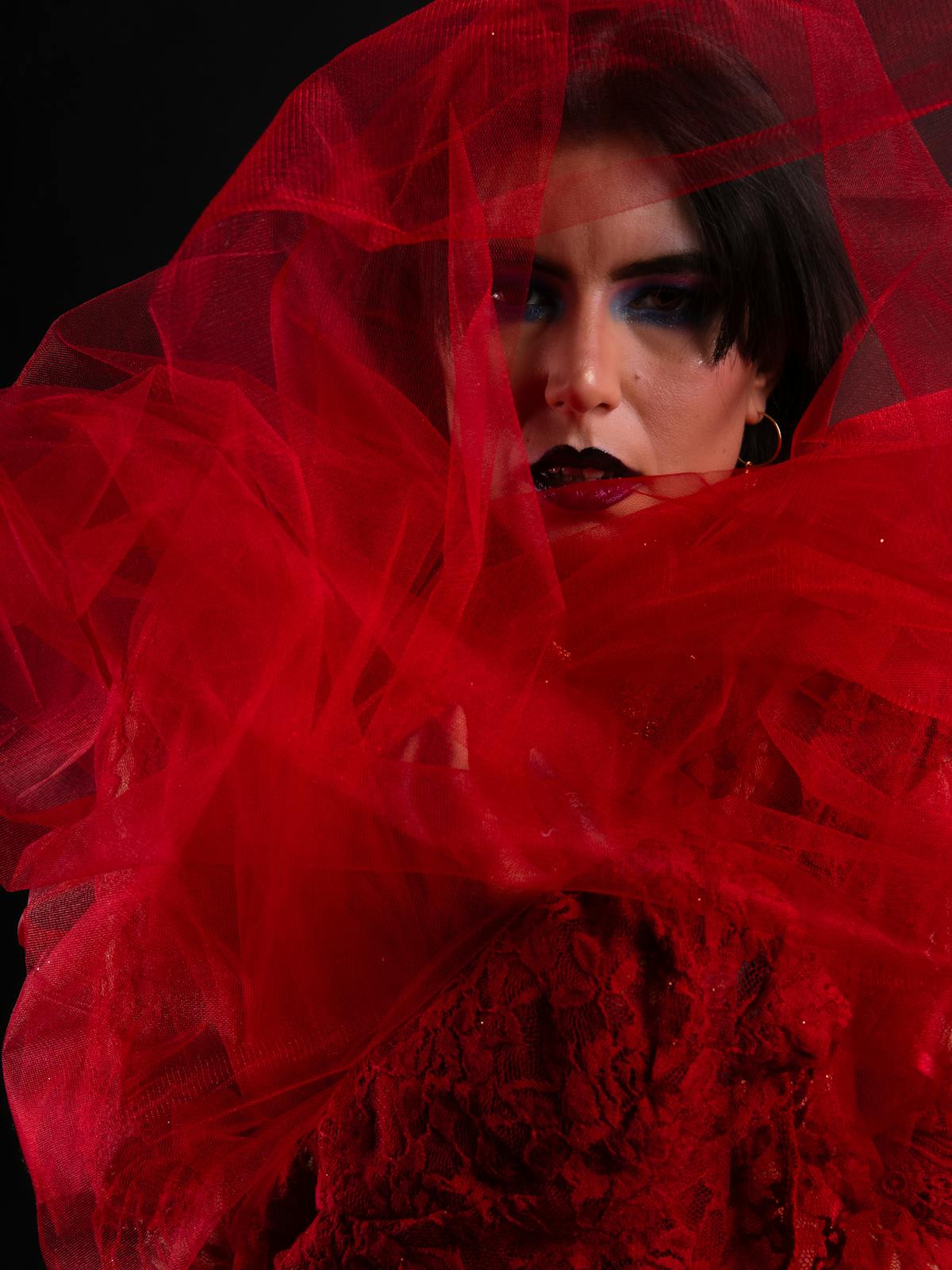
Color palette
Per-article accent slots. Each article binds one of these to--color-accent on <body>.
orange
—
yellow
—
lime
—
emerald
—
sky
—
red
—
lilac
—
iceblue
—
pink
—
mauve
—
chartreuse
—
Neutrals & brand
paper
—
ink
—
ink-muted
—
flash
—
Page moods
Each route declares a mood on its <PageShell>; the value writesbody[data-mood] which paints the canvas and crossfades on navigation.
paper
—
green
—
blue
—
ink (inverted)
—
accent (per article)
per-article
Typography
Two faces: --font-sans for body, UI, and display headings; --font-script for the wordmark middle word only. Sizes are CSS variables — edit in @theme.
Section caption · footer · base
Footer links · small UI
About body copy
Article body copy
Header nav · info bar
Mobile subject name
Article lead paragraph
Archive subject
About headline
Article title (legacy)
Spacing scale
Padding, gap, and margin tokens. The gutter pair --space-gutter / --space-gutter-mobile governs every section’s side rail.
--space-2
—
--space-3
—
--space-4
—
--space-5
—
--space-6
—
--space-gutter-mobile
—
--space-7
—
--space-gutter
—
--space-12
—
--space-14
—
--space-20
—
--space-24
—
--space-28
—
Form elements
Inputs sit on paper, ink text, pill outline. Combine with the button above for a complete signup row.
Archive cards
One pattern, used as a 2-up grid on /archive. Cover image carries the accent fallback when no photo is set. Stack of: cover · section caption · subject name.

Image treatment
All photographs across the template carry a subtle border-radius: 5px for a softened edge — covers, inline figures, archive cards, newsletter hero. Containers that hold a colored fallback match.
Cursor glow
Two stacked blurred dots follow the pointer site-wide — a magenta lead and a softer trailing halo. Disabled under prefers-reduced-motion and on touch-only pointers.
Move your cursor anywhere on this page to see the effect.
Home swiper hero
Full-bleed Swiper on / — slides per view ~2.4, centered, scaled neighbours, body accent synced to the active slide. Buyers swap the article list in content/articles.ts; the carousel rotates through everything.
Preview live on the home page — the layout is too dependent on viewport height to demo inline.